Role: Director of Product Design
The Challenge
Design a universal browsing experience for our TV apps, with the consideration to allow for faster content discovery, and fast-track the engineering process.
Team: 1 Product Designer, 1 Product Manager, 1 Research Partner
Deliverables:
User Personas (user research and empathy)
Lo-Fi Wireframes, Interaction Prototypes (validation/testing)
UI + Visual Design (development handoff)
The Big Picture
Leadership’s initial goal was to improve our TV apps user experience with the consideration to achieve parity across platforms to minimize editorial discrepancies and streamline the engineering and QA processes.
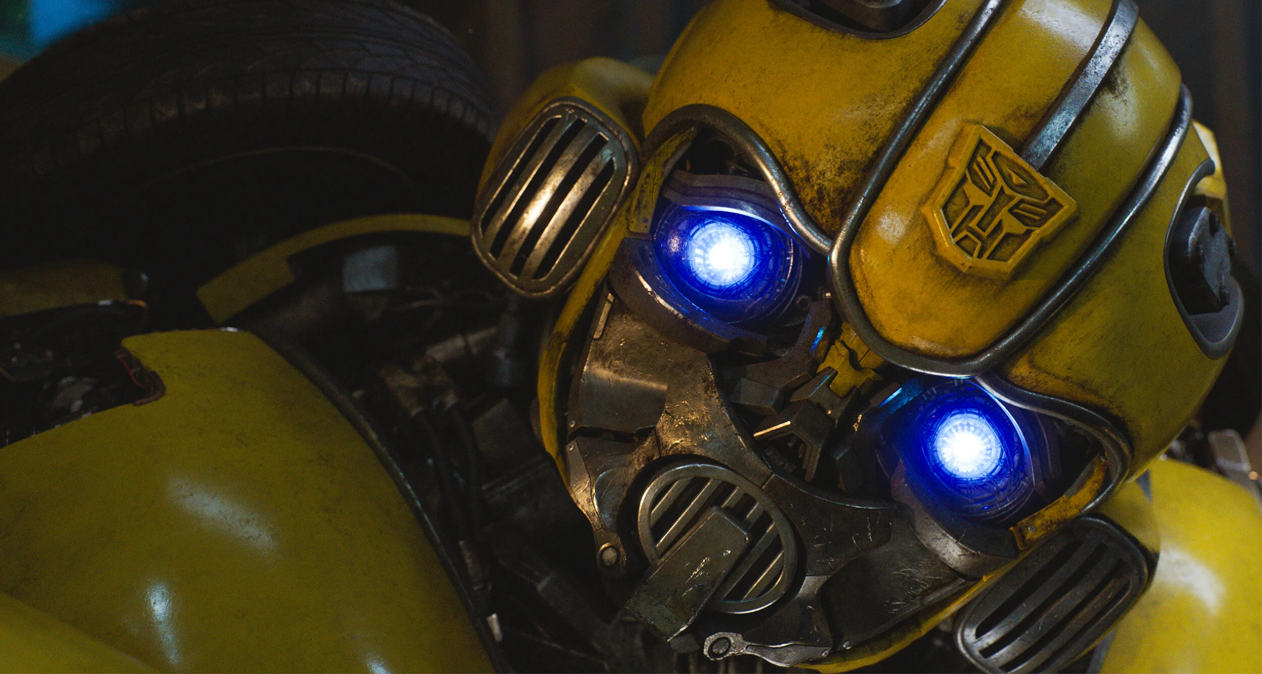
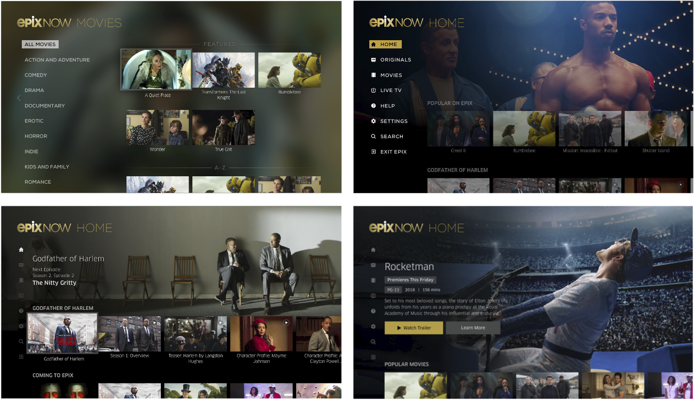
Examples of our old interface across multiple tv platforms.
The first step was to get more clarity. We knew we needed to better understand our audience before jumping into design to ensure everything we made solved the user’s needs.
Simplicity Wins
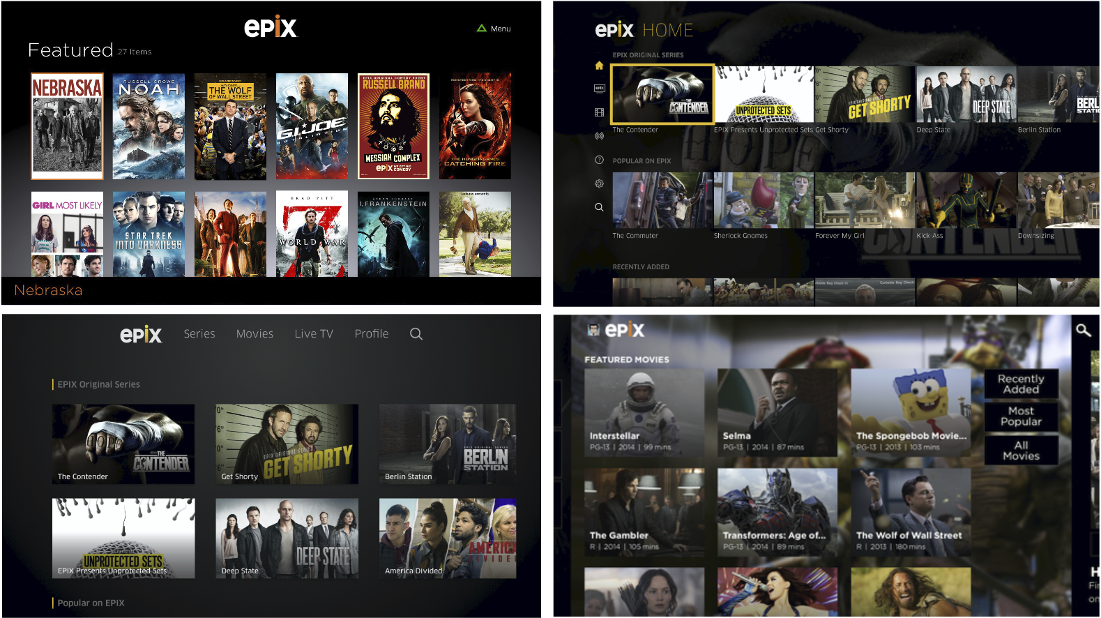
Our product team completed competitive analysis in order to evaluate our experience against our peer set. One recurrent theme we discussed across apps (including our own) was an abundance of choice overload.
We knew this was something we needed to address as it impedes user decision-making and often lead to analysis paralysis.
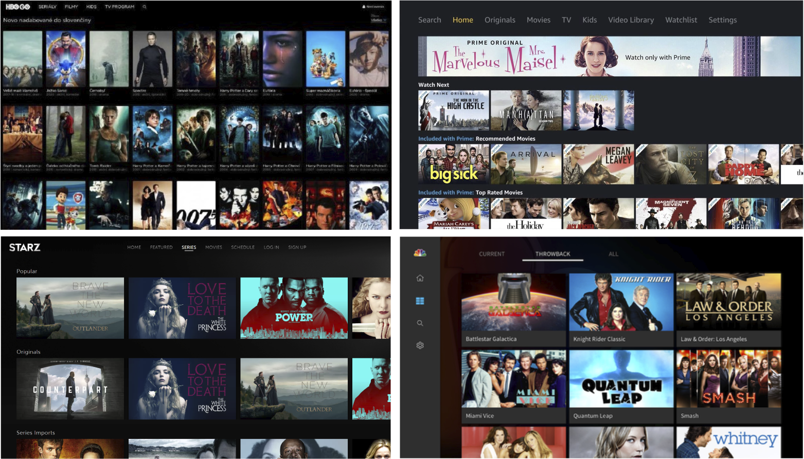
Select screens from competitive research.
Walking in Their Shoes
The next step was to work on personas so we could have quick, empathy-inducing references for our user needs during the design process.
We conducted two research projects to tackle this: a survey (n=50) and moderated interviews (n=10). We targeted our own EPIX NOW users and filled the gap by resourcing participants through our research partner.
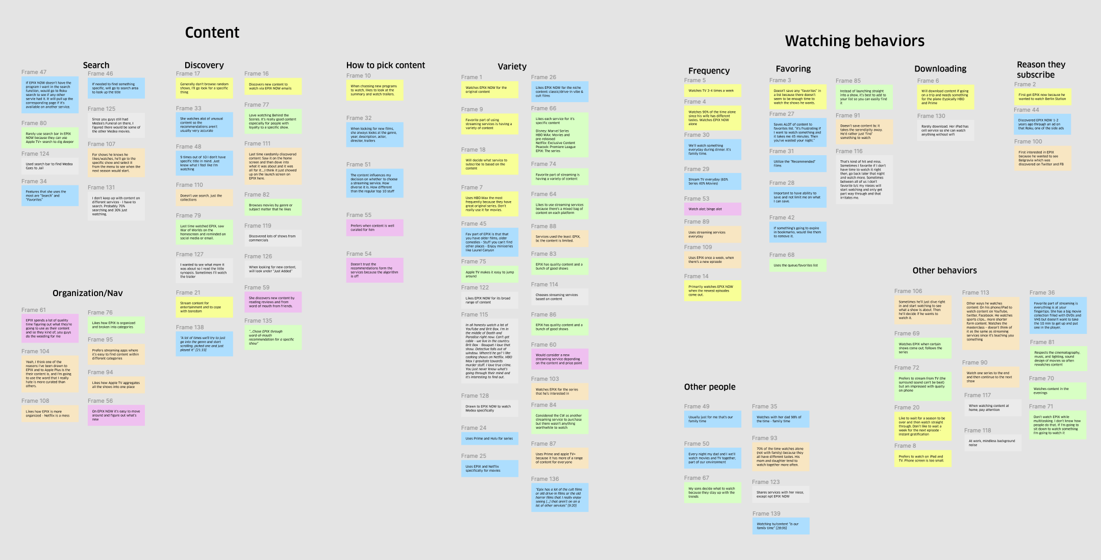
Affinity diagram exercise to help us make sense of the data we received.
Based on the research conducted, the team created the following personas:
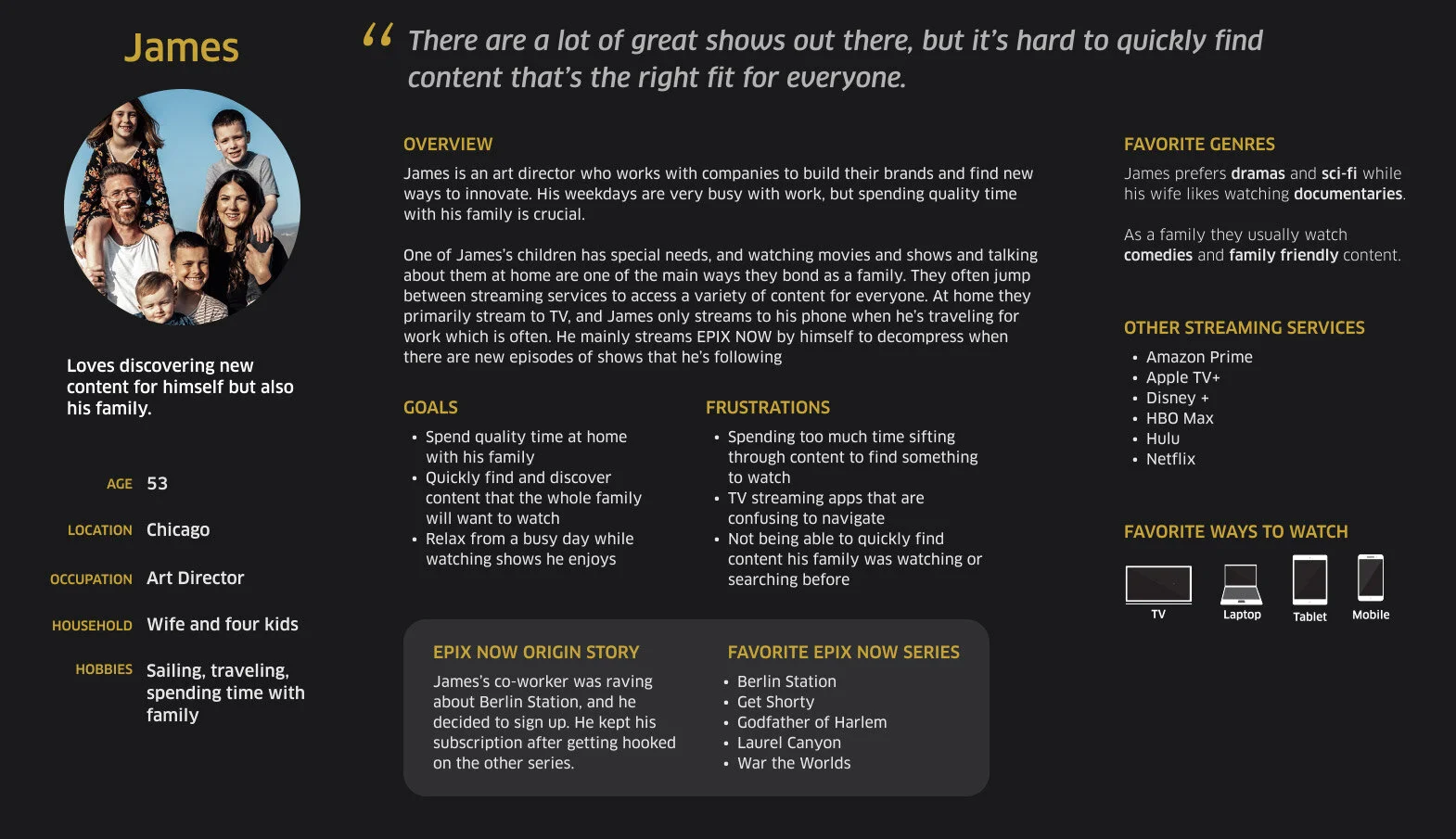
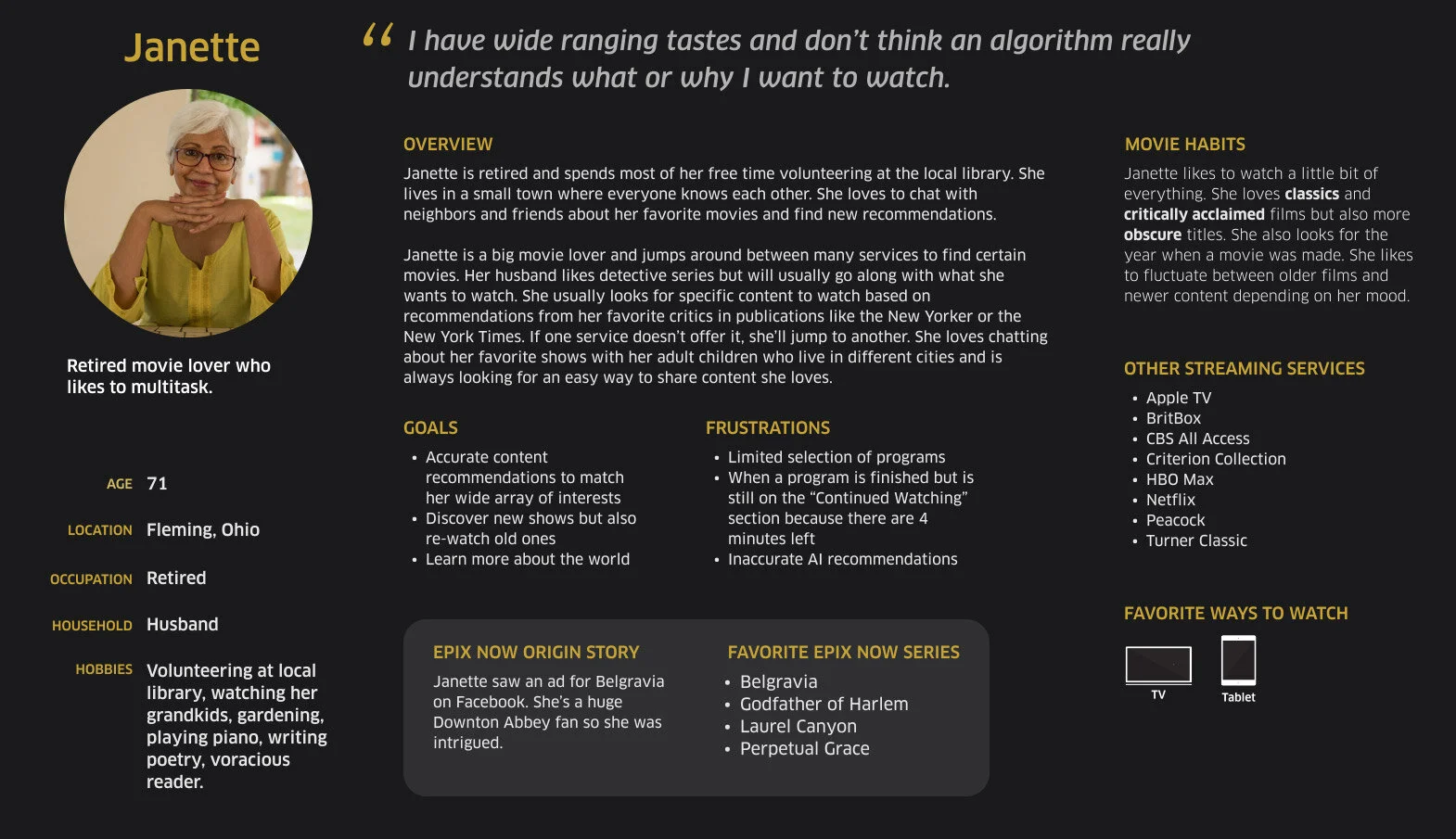
We learned that our target audience wants to spend little time finding something to watch. They also jump around many services to find something to watch.
How might we…
Improve the browsing speed functionality?
Improve content discoverability?
Setting The Foundation
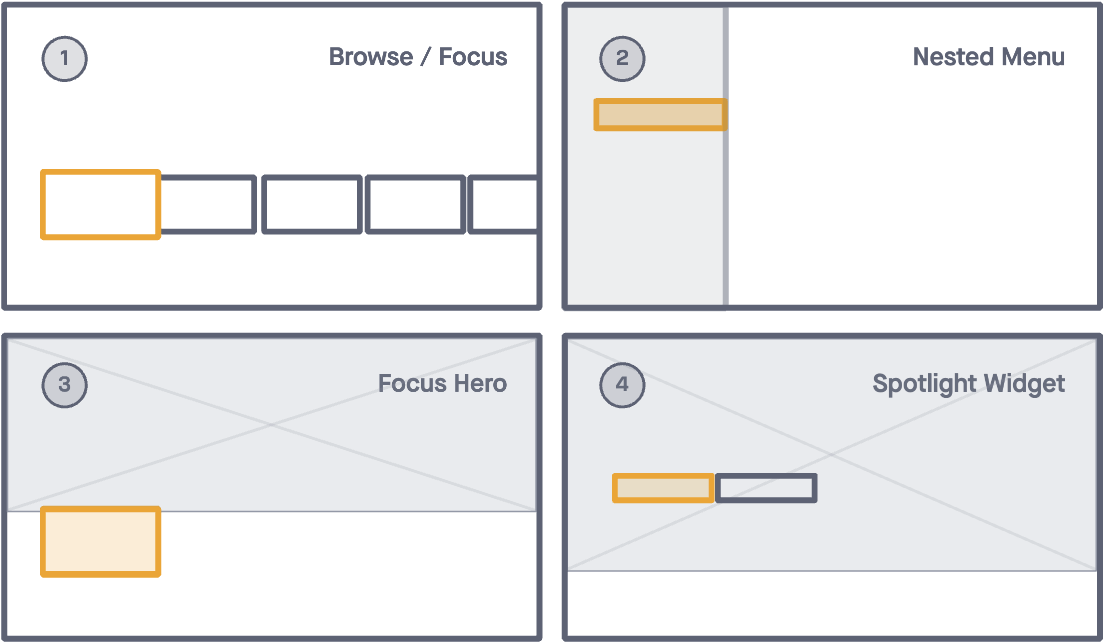
Through a series of ideation sessions, design, product, and engineering worked together to come up with a series of standard components:
We also developed a set of implementation principles in order to address the stakeholder goal of aiming for parity while working in Agile:
The component could be implemented across our Roku, Apple TV, XBox, and Samsung TV apps
The component could be used across multiple browsing screens
The component could be deployed independently from one another
The component will not impact/add editorial lift
These principles would allow our team to implement UX enhancements in smaller chunks, and also measure the effectiveness of the components against the previous iteration (and roll it back if deemed necessary).
Components:
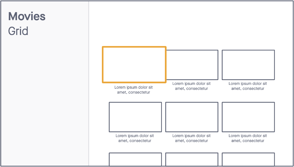
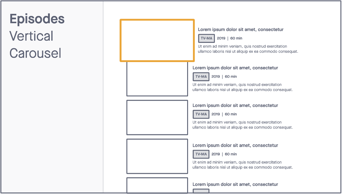
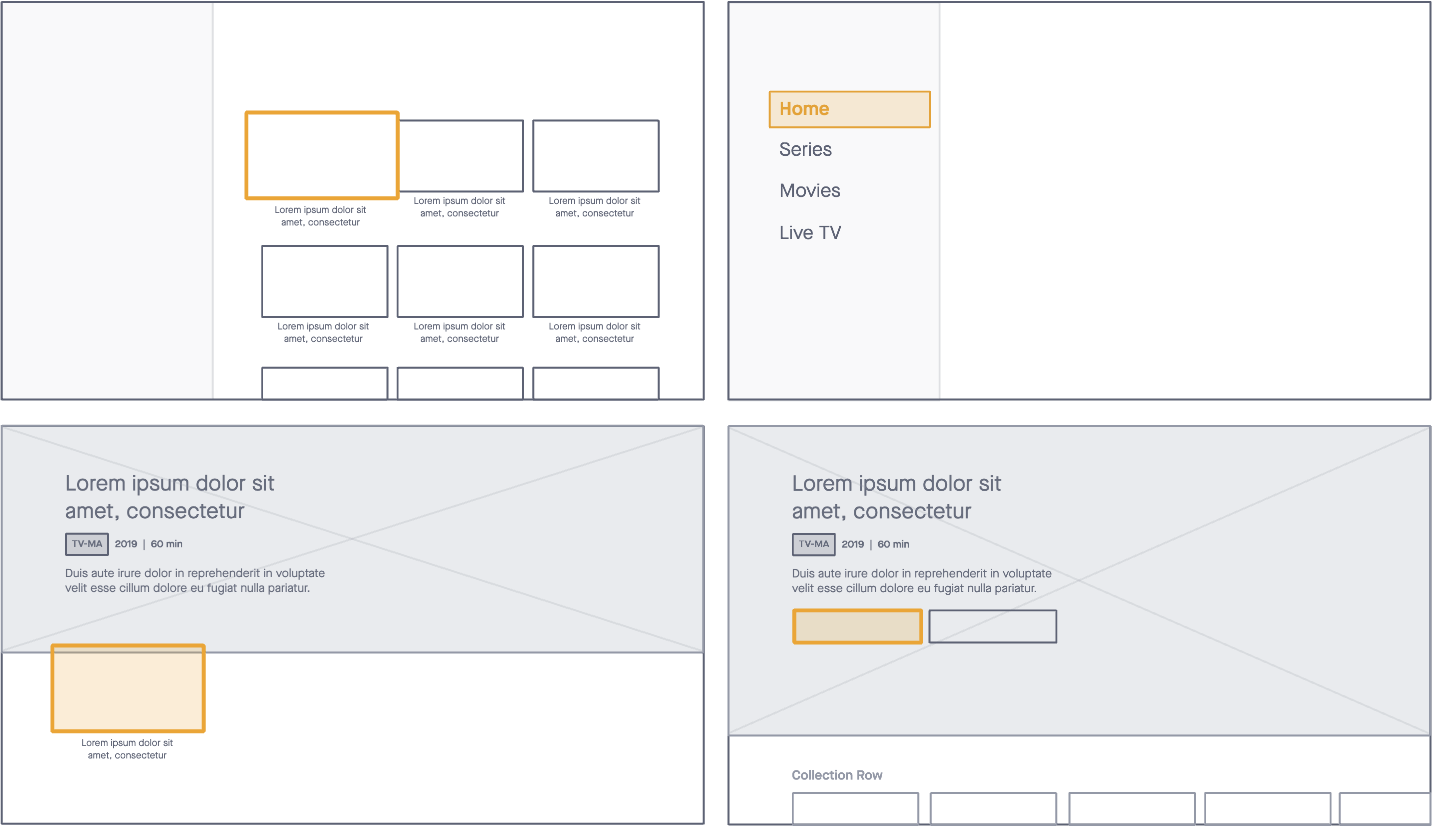
1) BROWSE/FOCUS with a standard size for thumbnails and collections. Intended initially for our home screen, this component could be used in a horizontal or vertical carousel as well as in a grid layout.
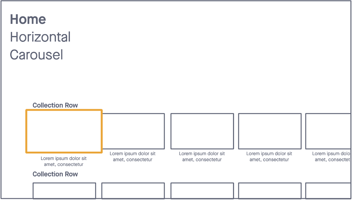
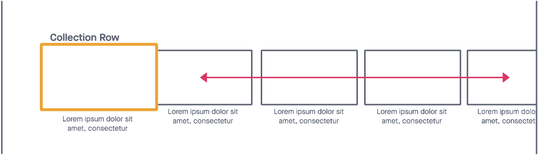
We decided to implement platform-specific focus logic best suited for each platform in order to improve browse functionality and performance across our browsing screens.
On tvOS we implemented native focus logic, where the focusable item can move from the left to the right of the screen.
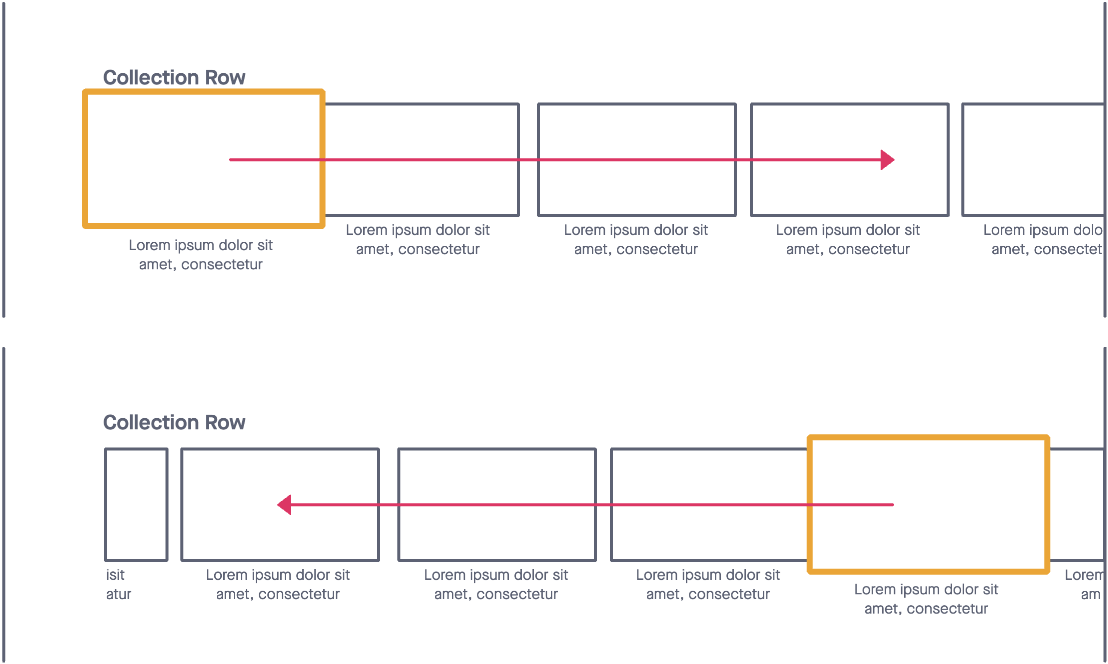
For Roku, XBox, Android TV and Samsung TV apps, we kept the focus static:
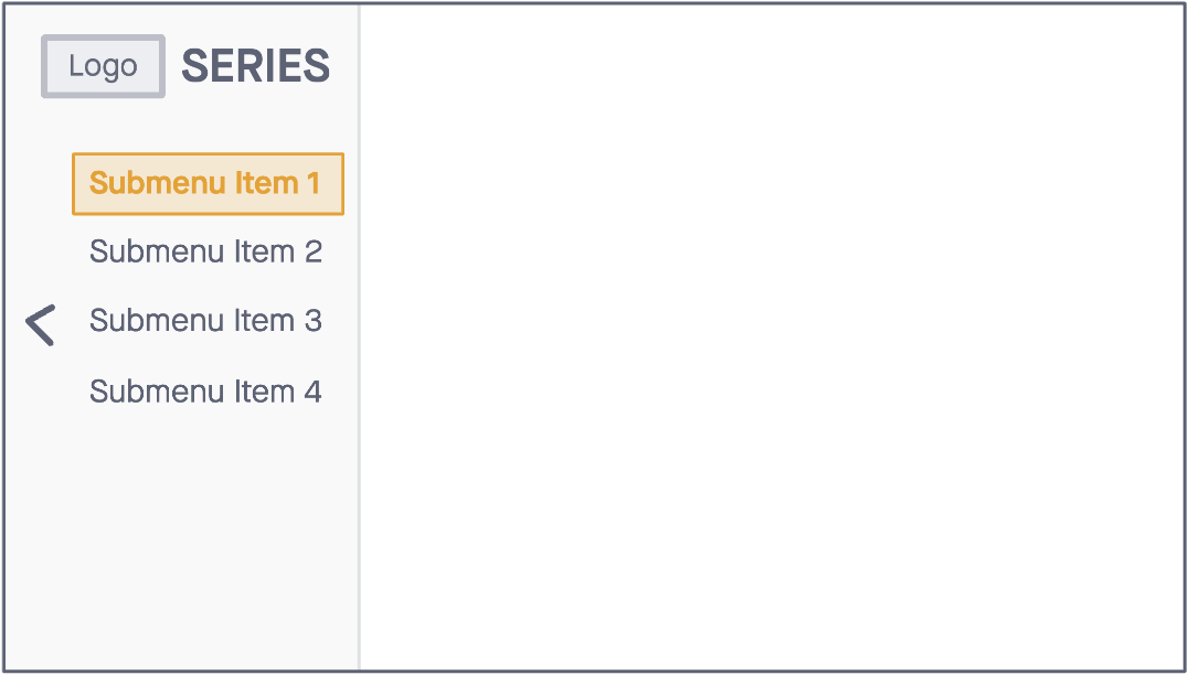
2) NESTED MENU to allow our navigation and app architecture to scale over time.

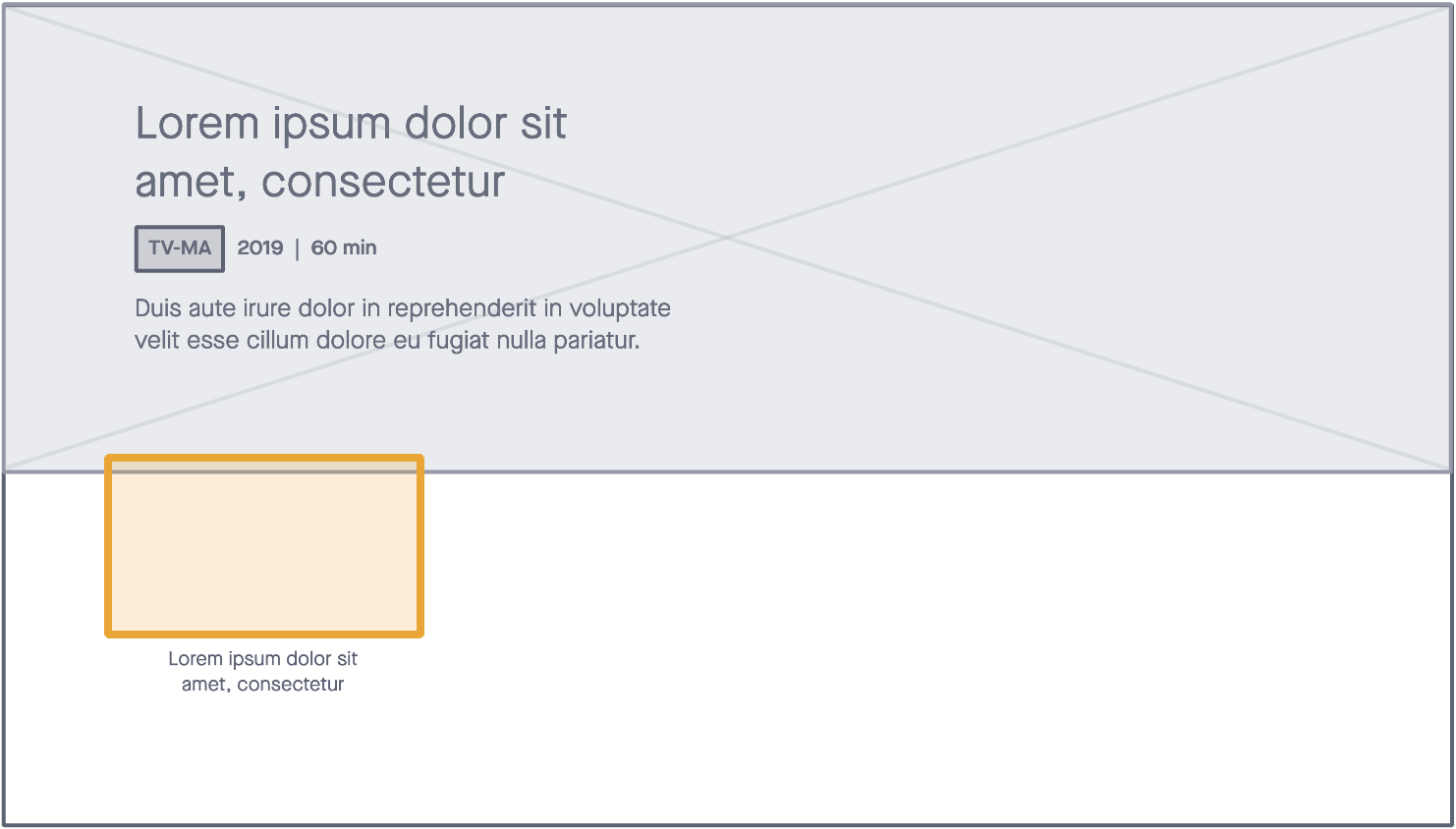
3) FOCUS HERO to disclose more context about the thumbnail in focus, with the goal to improve content discovery and faster decision-making.
4) SPOTLIGHT WIDGET to allow us to introduce a hierarchy of content to our browsing screens in order to better surface notable content while also adding nested menu functionality to our content within the same screen.
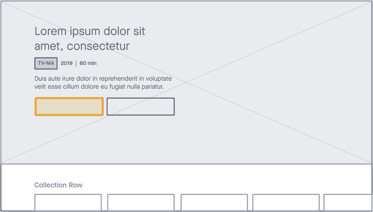
All components follow the current app architecture and programming schema, with the exception of the spotlight widget, which introduced a measured lift for the editorial design team. This added impact was documented and considered before implementation.
Putting Our Work to the Test
We conducted usability testing to help us understand the impact of these improvements. Early testing showed that time spent on task should improve from eleven seconds to four seconds (roughly 64%) or four times faster.
Key Learnings
Conduct stakeholder interviews as part of the problem statement and have clearly defined and documented goals from leadership. This will help inform our designs and validate our decisions when presenting solutions.
Accessibility and performance must be woven into the design decisions from the early stages of ideation to avoid frustration across the team.
Document everything. One can never have enough documentation around a project, especially long-term projects, where team turnover might be high, and getting re-familiarized with features that have been iceboxed might take some time.